HCRIS Data
The Raw Data
- Two versions (1996 and 2010)
- Structure (alphanumeric, numeric, report info)
- Extracting variables requires first locating in the report templates
Emory Net Patient Revenue and Medicare Discharges
plot.dat <- hcris.emory %>%
  group_by(year) %>%
  summarize(net_rev=mean(net_pat_rev, na.rm=TRUE)/1000000,
            mcare=mean(mcare_discharges,  na.rm=TRUE)) %>%
  ungroup()

rev.plot <- plot.dat %>%
  ggplot(aes(x=as.factor(year), y=net_rev)) +
  geom_line(aes(group=1), linewidth = 1) +
  labs(
    x = "Year",
    y = "$ in millions",
    title = "Mean Patient Revenue Over Time"
  ) +
  theme_bw() +
  theme(axis.text.x = element_text(angle = 90, hjust = 1))

mcare.plot <- plot.dat %>%
  ggplot(aes(x=as.factor(year), y=mcare)) +
  geom_line(aes(group=1), linewidth = 1) +
  labs(
    x = "Year",
    y = "Discharges",
    title = "Mean Medicare Discharges Over Time"
  ) +
  theme_bw() +
  theme(axis.text.x = element_text(angle = 90, hjust = 1))
import pandas as pd
import matplotlib.pyplot as plt
# Aggregate to year means
plot_dat = (
hcris_emory
.groupby("year", as_index=False)
.agg(
net_rev=("net_pat_rev", lambda x: x.mean(skipna=True) / 1_000_000),
mcare=("mcare_discharges", "mean")
)
)
plt.figure()
plt.plot(plot_dat["year"], plot_dat["net_rev"], linewidth=1)
plt.xlabel("Year")
plt.ylabel("$ in millions")
plt.title("Mean Patient Revenue Over Time")
plt.xticks(rotation=90)
plt.tight_layout()
plt.show()
plt.figure()
plt.plot(plot_dat["year"], plot_dat["mcare"], linewidth=1)
plt.xlabel("Year")
plt.ylabel("Discharges")
plt.title("Mean Medicare Discharges Over Time")
plt.xticks(rotation=90)
plt.tight_layout()
plt.show()
HCRIS for All Hospitals
hcris.data <- read_csv("../data/output/hcris-snippets/hcris-data.csv")
hosp.count.plot <- hcris.data %>%
  ggplot(aes(x=as.factor(year))) +
  geom_bar() +
  labs(
    x="Year",
    y="Number of Hospitals",
    title="Number of Hospitals per Year"
  ) + theme_bw() +
  theme(axis.text.x = element_text(angle = 90, hjust=1))
import pandas as pd
import matplotlib.pyplot as plt
hcris_data = pd.read_csv("../data/output/hcris-snippets/hcris-data.csv")
fig, ax = plt.subplots()
ax.hist(hcris_data["year"], bins=len(hcris_data["year"].unique()))
ax.set_xlabel("Year")
ax.set_ylabel("Number of Hospitals")
ax.set_title("Number of Hospitals per Year")
ax.tick_params(axis="x", rotation=90)
plt.tight_layout()
plt.show()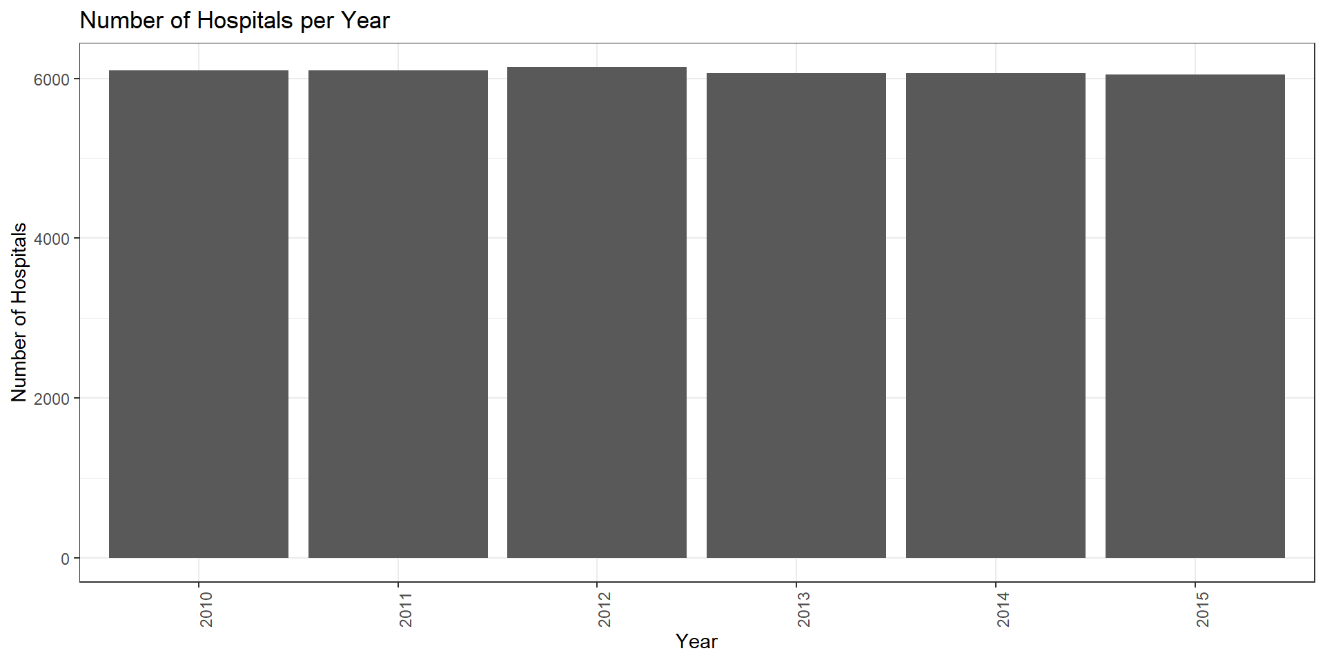
Emory Prices in HCRIS
emory.price <- hcris.emory %>%
  mutate( discount_factor = 1-tot_discounts/tot_charges,
          price_num = (ip_charges + icu_charges + ancillary_charges)*discount_factor - tot_mcare_payment,
          price_denom = tot_discharges - mcare_discharges,
          price = price_num/price_denom) %>%
  select(provider_number, year, price)

emory.price.plot <- emory.price %>%
  group_by(year) %>%
  summarize(mean_price=mean(price, na.rm=TRUE)) %>%
  ungroup() %>%
  ggplot(aes(x=as.factor(year), y=mean_price)) +
  geom_line(aes(group=1), linewidth = 1) +
  labs(
    x = "Year",
    y = "Dollars",
    title = "Mean Price for Emory Hospitals (EUH and Midtown)"
  ) +
  theme_bw() +
  theme(axis.text.x = element_text(angle = 90, hjust = 1))
import pandas as pd
import matplotlib.pyplot as plt
import numpy as np
emory_price = (
hcris_emory
.assign(
discount_factor = 1 - hcris_emory["tot_discounts"] / hcris_emory["tot_charges"],
price_num = (
hcris_emory["ip_charges"]
+ hcris_emory["icu_charges"]
+ hcris_emory["ancillary_charges"]
) * (1 - hcris_emory["tot_discounts"] / hcris_emory["tot_charges"])
- hcris_emory["tot_mcare_payment"],
price_denom = hcris_emory["tot_discharges"] - hcris_emory["mcare_discharges"]
)
.assign(
price = lambda d: d["price_num"] / d["price_denom"]
)
.loc[:, ["provider_number", "year", "price"]]
)
price_year = (
emory_price
.replace([np.inf, -np.inf], np.nan)
.groupby("year", as_index=False)
.agg(mean_price=("price", "mean"))
)
fig, ax = plt.subplots()
ax.plot(price_year["year"], price_year["mean_price"], linewidth=1)
ax.set_xlabel("Year")
ax.set_ylabel("Dollars")
ax.set_title("Mean Price for Emory Hospitals (EUH and Midtown)")
ax.tick_params(axis="x", rotation=90)
plt.tight_layout()
plt.show()
Prices in the Full HRIS Data
price.plot <- hcris.data %>% group_by(year) %>%
  summarize(mean_price=mean(price, na.rm=TRUE)) %>%
  ggplot(aes(x=as.factor(year), y=mean_price)) +
  geom_line(aes(group=1)) +
  labs(
    x="Year",
    y="Average Hospital Price",
    title="Hospital Prices per Year"
  ) + scale_y_continuous(labels=comma) +
  theme_bw() + theme(axis.text.x = element_text(angle = 90, hjust=1))
import pandas as pd
import matplotlib.pyplot as plt
from matplotlib.ticker import FuncFormatter
import numpy as np
price_year = (
hcris_data
.groupby("year", as_index=False)
.agg(mean_price=("price", "mean"))
)
comma_fmt = FuncFormatter(lambda x, pos: f"{int(x):,}")
fig, ax = plt.subplots()
ax.plot(price_year["year"], price_year["mean_price"], linewidth=1)
ax.set_xlabel("Year")
ax.set_ylabel("Average Hospital Price")
ax.set_title("Hospital Prices per Year")
ax.yaxis.set_major_formatter(comma_fmt)
ax.tick_params(axis="x", rotation=90)
plt.tight_layout()
plt.show()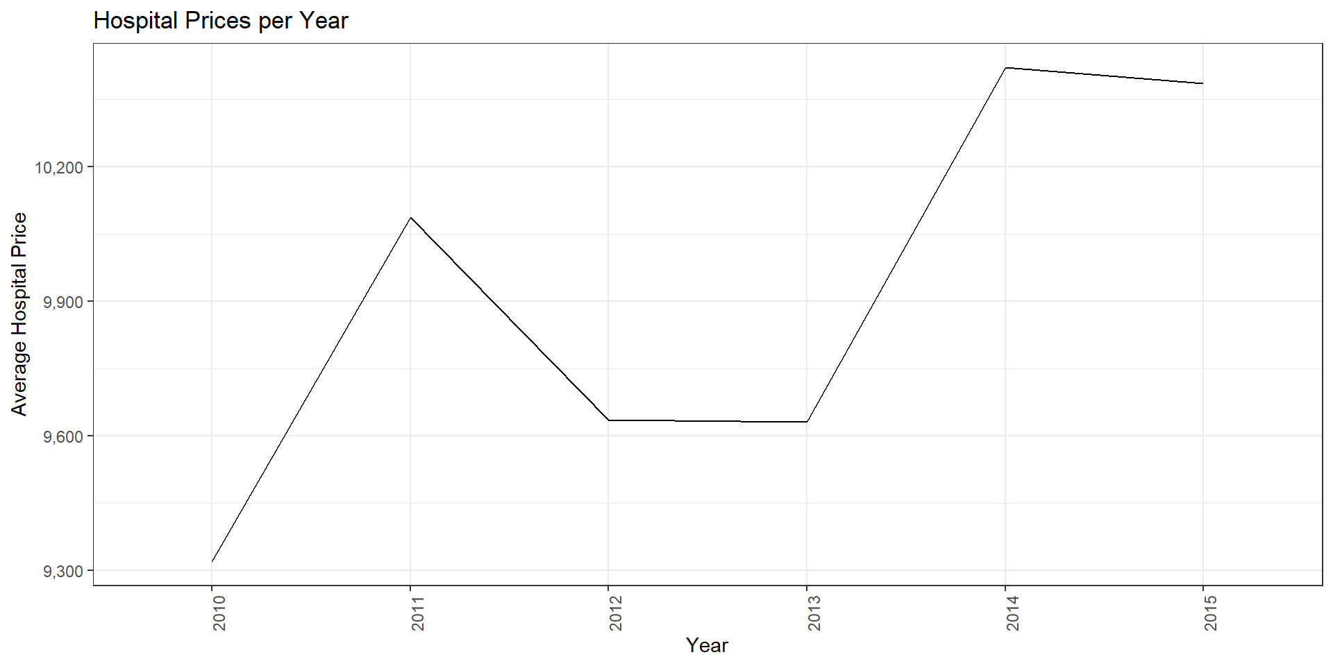
Removing very high prices
price.plot2 <- hcris.data %>%
  filter(price>0) %>%
  group_by(year) %>%
  mutate(
    p95 = quantile(price, 0.95, na.rm = TRUE),
    p05 = quantile(price, 0.05, na.rm = TRUE),
    price = pmin(pmax(price, p05), p95)
  ) %>%
  summarize(mean_price=mean(price, na.rm=TRUE)) %>%
  ggplot(aes(x=as.factor(year), y=mean_price)) +
  geom_line(aes(group=1)) +
  labs(
    x="Year",
    y="Average Hospital Price",
    title="Hospital Prices per Year"
  ) + scale_y_continuous(labels=comma) +
  theme_bw() + theme(axis.text.x = element_text(angle = 90, hjust=1))
import numpy as np
import pandas as pd
import matplotlib.pyplot as plt
from matplotlib.ticker import FuncFormatter
# comma formatter (ggplot::comma analogue)
comma_fmt = FuncFormatter(lambda x, pos: f"{int(x):,}")
# filter, winsorize within-year, then average within-year
df2 = hcris_data.loc[hcris_data["price"] > 0, ["year", "price"]].copy()
def winsorize_group(g):
p95 = g["price"].quantile(0.95)
p05 = g["price"].quantile(0.05)
g["price"] = g["price"].clip(lower=p05, upper=p95)
return g
price_year2 = (
df2.groupby("year", group_keys=False)
.apply(winsorize_group)
.groupby("year", as_index=False)
.agg(mean_price=("price", "mean"))
)
# plot
fig, ax = plt.subplots()
ax.plot(price_year2["year"].astype(str), price_year2["mean_price"], linewidth=1) # factor(year) analogue
ax.set_xlabel("Year")
ax.set_ylabel("Average Hospital Price")
ax.set_title("Hospital Prices per Year")
ax.yaxis.set_major_formatter(comma_fmt)
ax.tick_params(axis="x", rotation=90)
plt.tight_layout()
plt.show()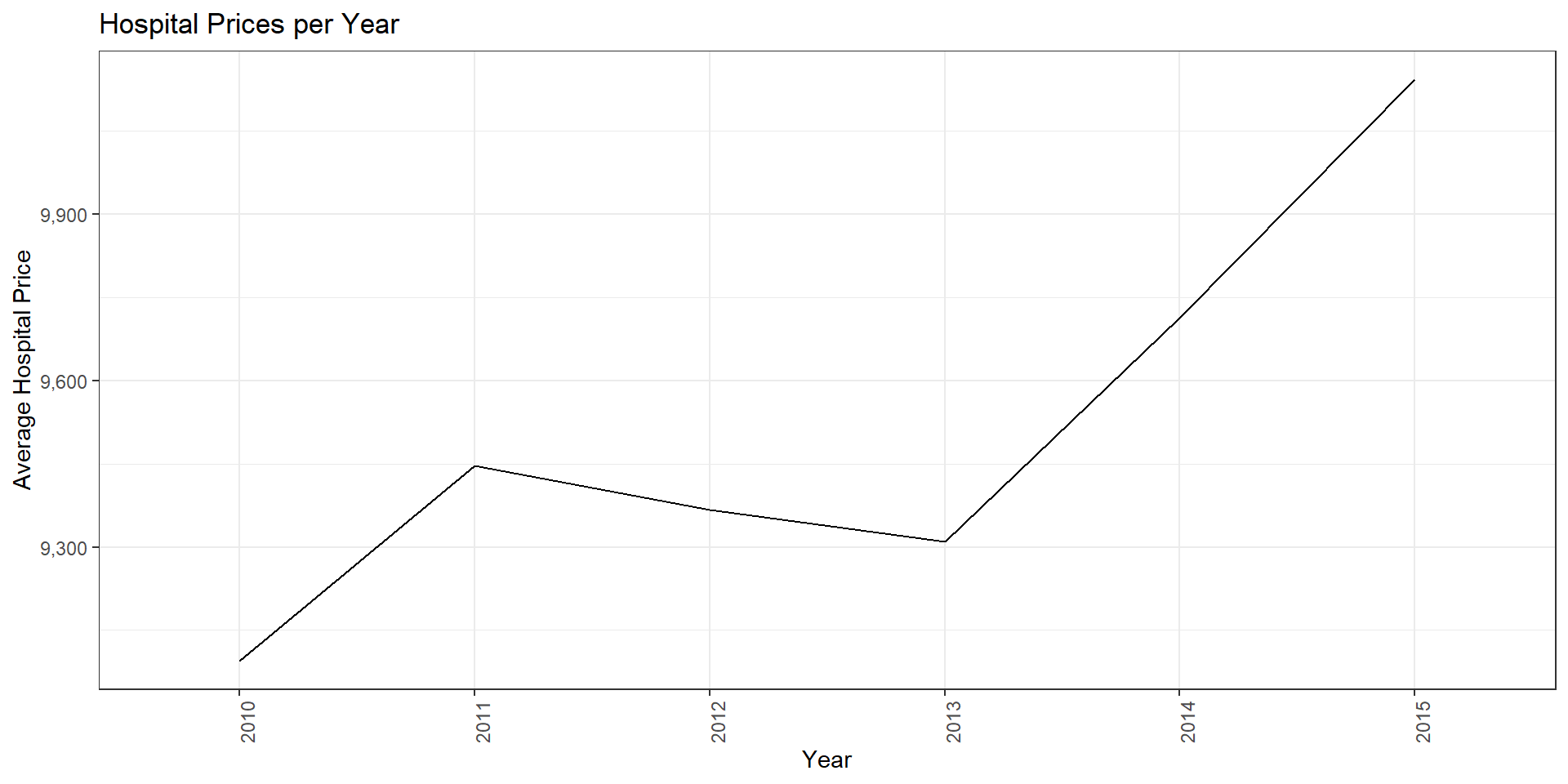
Share of Penalized Hospitals
share.hrrp <- hcris.data %>%
  mutate(penalized=if_else(hrrp_payment>0 & !is.na(hrrp_payment), 1, 0)) %>%
  group_by(year) %>%
  summarize(share_hrrp=mean(penalized, na.rm=TRUE)) %>%
  ggplot(aes(x=as.factor(year), y=share_hrrp)) +
  geom_line(aes(group=1)) +
  labs(
    x="Year",
    y="Share of Hospitals",
    title="Penalized Hospitals by Year"
  ) + scale_y_continuous(labels=comma) +
  theme_bw() + theme(axis.text.x = element_text(angle = 90, hjust=1))
import pandas as pd
import numpy as np
import matplotlib.pyplot as plt
from matplotlib.ticker import FuncFormatter
share_year = (
hcris_data
.assign(
penalized = np.where(
(hcris_data["hrrp_payment"] > 0) & (~hcris_data["hrrp_payment"].isna()),
1, 0
)
)
.groupby("year", as_index=False)
.agg(share_hrrp=("penalized", "mean"))
)
fig, ax = plt.subplots()
ax.plot(share_year["year"].astype(str), share_year["share_hrrp"], linewidth=1)
ax.set_xlabel("Year")
ax.set_ylabel("Share of Hospitals")
ax.set_title("Penalized Hospitals by Year")
# keep comma formatter to mirror ggplot call (though shares typically don't need it)
comma_fmt = FuncFormatter(lambda x, pos: f"{x:,.2f}")
ax.yaxis.set_major_formatter(comma_fmt)
ax.tick_params(axis="x", rotation=90)
plt.tight_layout()
plt.show()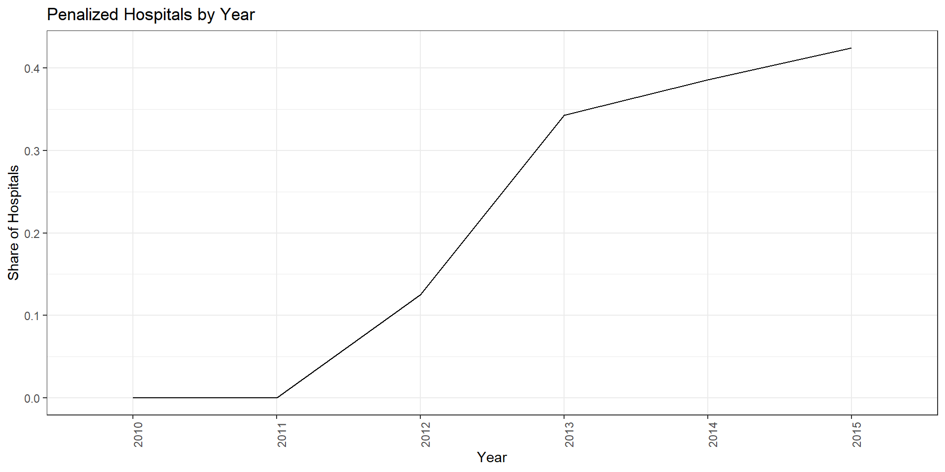
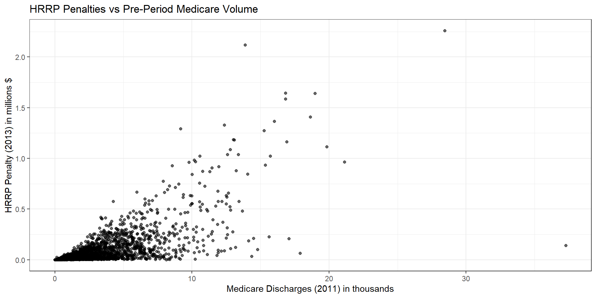
Medicare Patients
mcare.hrrp <- hcris.data %>%
  filter(year %in% c(2011, 2013)) %>%
  group_by(provider_number) %>%
  summarize(
    mcare_2011    = mcare_discharges[year == 2011][1]/1000,
    hrrp_pay_2013 = hrrp_payment[year == 2013][1]/1000000,
    .groups = "drop"
  ) %>%
  drop_na(mcare_2011, hrrp_pay_2013)

mcare.hrrp.plot <- ggplot(mcare.hrrp, aes(x = mcare_2011, y = hrrp_pay_2013)) +
  geom_point(alpha = 0.6) +
  labs(
    x = "Medicare Discharges (2011) in thousands",
    y = "HRRP Penalty (2013) in millions $",
    title = "HRRP Penalties vs Pre-Period Medicare Volume"
  ) +
  theme_bw()
import pandas as pd
import numpy as np
import matplotlib.pyplot as plt
mcare_hrrp = (
hcris_data
.loc[hcris_data["year"].isin([2011, 2013])]
.groupby("provider_number", as_index=False)
.agg(
mcare_2011=("mcare_discharges",
lambda x: x[hcris_data.loc[x.index, "year"] == 2011].iloc[0] / 1_000),
hrrp_pay_2013=("hrrp_payment",
lambda x: x[hcris_data.loc[x.index, "year"] == 2013].iloc[0] / 1_000_000)
)
.dropna(subset=["mcare_2011", "hrrp_pay_2013"])
)
fig, ax = plt.subplots()
ax.scatter(
mcare_hrrp["mcare_2011"],
mcare_hrrp["hrrp_pay_2013"],
alpha=0.6
)
ax.set_xlabel("Medicare Discharges (2011) in thousands")
ax.set_ylabel("HRRP Penalty (2013) in millions $")
ax.set_title("HRRP Penalties vs Pre-Period Medicare Volume")
plt.tight_layout()
plt.show()