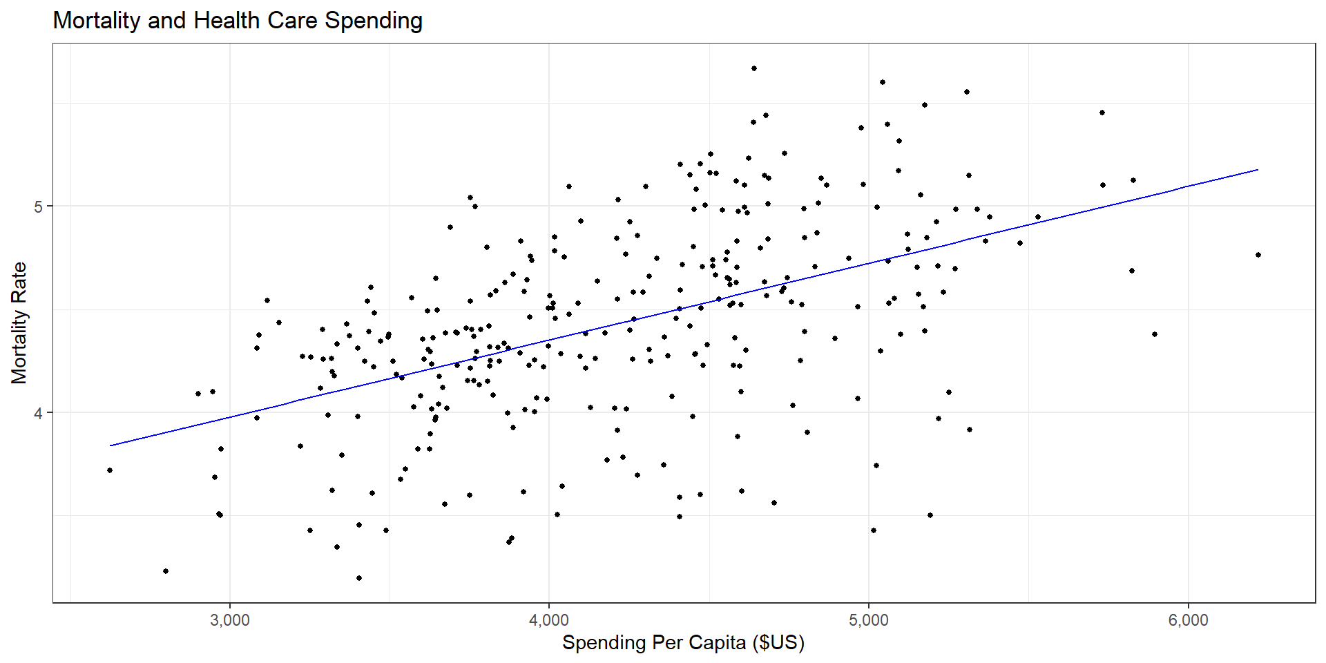
R Code
ggplot(data = (dartmouth.data %>% filter(Year==2015)),
       mapping = aes(x = Expenditures, y = Total_Mortality)) +
  geom_point(size = 1) + theme_bw() + scale_x_continuous(label = comma) +
  geom_smooth(method="lm", se=FALSE, color="blue", size=1/2) +
  labs(x = "Spending Per Capita ($US)",
       y = "Mortality Rate",
       title = "Mortality and Health Care Spending")


